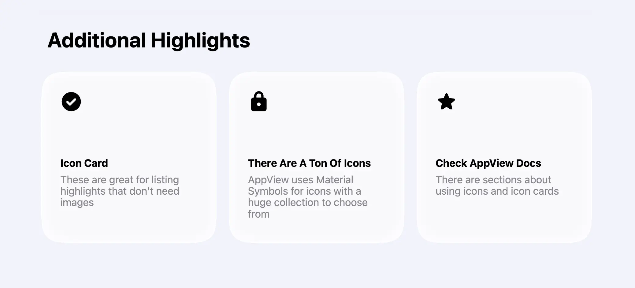
The default AppView layout includes an “Additional Highlights” section after
testimonials. It uses the same <CardGrid> component as the
features grid but uses only
<CardGrid.IconCard> components.
This type of section is great for mentioning a few extra features or qualities of the app that don’t require screenshots or screen recordings. It could be things like privacy focus or iCloud support.
Adding extra icons
AppView uses Material Symbols for all its
icons. Pick any icon you’d like to use from their library, copy its name, and
add it to the MATERIAL_SYMBOLS list in the src/constants.ts file.
export const MATERIAL_SYMBOLS = [..."any_other_icon_you_need"] as const;AppView will download only icons included in that list to keep your website size small and improve loading speed.
Make sure to check the Icons guide for more details on using icons.
Customizing the cards
Once you pick the icons, edit iconName, title and description properties
of the <CardGrid.IconCard> components inside the app/(main)/page.tsx file.
<Section title="Additional Highlights">
  <CardGrid rowHeight={280}>
    <CardGrid.IconCard
      maxWidth="third"
      iconName="check_circle"
      title="Icon Card"
      description="These are great for listing highlights that don't need images"
    />
    ...
  </CardGrid>
</Section>
All default sections are set at this point, and you can move on to configuring the top navigation bar and the footer.