Reference<CardGrid>
See the Custom card grid layouts guide for all possible card variants and customizations.
Also check the reference for the individual card types:
<CardGrid> Properties
| Property | Value | Description |
|---|---|---|
rowHeight | number | Sets the height of each row of the grid. All cards inside a single grid are always the same height, but you can combine grids of different row heights within a single section to achieve a more dynamic layout. |
Grid Templates
Pick one of the grid layouts that fits the purpose of a specific section on your
website, copy and paste its code into app/(main)/page.tsx nested within
<Section>, then customize it by adjusting titles, descriptions, and media.
Template 1
Preview
Code
<CardGrid rowHeight={438}>
  <CardGrid.StackedCard
    maxWidth="full"
    title="Calm routines"
    description="Build small, repeatable habits with gentle reminders and a simple daily view."
    media={
      <CardGrid.StackedCard.Image
        src="/app_view/screenshot_placeholder.png"
        bezel="iPhone 17 Black"
        bezelCrop={{ edge: "bottom", croppedRatio: 0.35 }}
        alt=""
      />
    }
    layoutDirection="forward"
    textAlignment="leading"
  />

  <CardGrid.StackedCard
    maxWidth="half"
    title="Notes to mark milestones"
    titleFontStyle="cursive"
    description="Capture quick thoughts, tag them later, and keep everything searchable."
    media={
      <CardGrid.StackedCard.Image
        src="/app_view/screenshot_placeholder.png"
        bezel="iPhone 17 Black"
        bezelCrop={{ edge: "bottom", croppedRatio: 0.5 }}
        alt=""
      />
    }
    layoutDirection="reverse"
    textAlignment="center"
  />

  <CardGrid.StackedCard
    maxWidth="half"
    title="A quieter way to track time"
    description="See where your day goes with lightweight timers and a clean timeline."
    media={
      <CardGrid.StackedCard.Image
        src="/app_view/screenshot_placeholder.png"
        bezel="iPhone 17 Black"
        bezelCrop={{ edge: "top", croppedRatio: 0.5 }}
        alt=""
      />
    }
    layoutDirection="forward"
    textAlignment="center"
  />

  <CardGrid.StackedCard
    maxWidth="full"
    title="Music practice, organized"
    description="Plan sessions, log what you worked on, and track progress over weeks."
    media={
      <CardGrid.StackedCard.Image
        src="/app_view/screenshot_placeholder.png"
        bezel="iPhone 17 Black"
        bezelCrop={{ edge: "bottom", croppedRatio: 0.35 }}
        alt=""
      />
    }
    layoutDirection="reverse"
    textAlignment="trailing"
  />
</CardGrid>
Template 2
Preview
Code
<CardGrid rowHeight={438}>
  <CardGrid.StackedCard
    maxWidth="half"
    title="Notes to mark milestones"
    titleFontStyle="cursive"
    description="Capture quick thoughts, tag them later, and keep everything searchable."
    media={
      <CardGrid.StackedCard.Image
        src="/app_view/screenshot_placeholder.png"
        bezel="iPhone 17 Black"
        bezelCrop={{ edge: "bottom", croppedRatio: 0.5 }}
        alt=""
      />
    }
    layoutDirection="reverse"
    textAlignment="center"
  />

  <CardGrid.StackedCard
    maxWidth="half"
    title="Calm routines"
    description="Build small, repeatable habits with gentle reminders and a simple daily view."
    media={
      <CardGrid.StackedCard.Image
        src="/app_view/screenshot_placeholder.png"
        bezel="iPhone 17 Black"
        bezelCrop={{ edge: "top", croppedRatio: 0.5 }}
        alt=""
      />
    }
    layoutDirection="forward"
    textAlignment="center"
  />

  <CardGrid.StackedCard
    maxWidth="third"
    title="A quieter way to track time"
    description="See where your day goes with lightweight timers and a clean timeline."
    media={
      <CardGrid.StackedCard.Image
        src="/app_view/stacked_card_image_placeholder_light.png"
        alt=""
      />
    }
    layoutDirection="forward"
    textAlignment="leading"
  />

  <CardGrid.StackedCard
    maxWidth="third"
    title="Music practice, organized"
    description="Plan sessions, log what you worked on, and track progress over weeks."
    media={
      <CardGrid.StackedCard.Image
        src="/app_view/stacked_card_image_placeholder_light.png"
        alt=""
      />
    }
    layoutDirection="reverse"
    textAlignment="center"
  />

  <CardGrid.StackedCard
    maxWidth="third"
    title="Shared lists"
    description="Keep a lightweight list in sync with one other person."
    media={
      <CardGrid.StackedCard.Image
        src="/app_view/stacked_card_image_placeholder_light.png"
        alt=""
      />
    }
    layoutDirection="forward"
    textAlignment="trailing"
  />
</CardGrid>
Template 3
Preview
Code
<CardGrid rowHeight={338}>
  <CardGrid.IconCard
    maxWidth="third"
    iconName="check_circle"
    title="Daily check‑ins"
    description="A quick summary of what’s done, what’s next, and what can wait."
  />

  <CardGrid.StackedCard
    maxWidth="twoThirds"
    title="Calm routines"
    description="Build small, repeatable habits with gentle reminders and a simple daily view."
    media={
      <CardGrid.StackedCard.Image
        src="/app_view/screenshot_placeholder.png"
        bezel="iPhone 17 Black"
        bezelCrop={{ edge: "bottom", croppedRatio: 0.2 }}
        alt=""
      />
    }
    layoutDirection="reverse"
    textAlignment="leading"
  />

  <CardGrid.StackedCard
    maxWidth="twoThirds"
    title="Quiet reminders"
    description="Nudge yourself at the right time without noisy notifications."
    media={
      <CardGrid.StackedCard.Image
        src="/app_view/screenshot_placeholder.png"
        bezel="iPhone 17 Black"
        bezelCrop={{ edge: "top", croppedRatio: 0.35 }}
        alt=""
      />
    }
    layoutDirection="forward"
    textAlignment="center"
  />

  <CardGrid.IconCard
    maxWidth="third"
    iconName="target"
    title="Focus sessions"
    description="Set a timer, keep distractions out, and stop when you’re done."
  />
</CardGrid>
Template 4
Preview
Code
<CardGrid rowHeight={280}>
  <CardGrid.IconCard
    maxWidth="third"
    iconName="check_circle"
    title="Icon Card"
    description="These are great for listing highlights that don't need images"
  />

  <CardGrid.IconCard
    maxWidth="third"
    iconName="lock"
    title="There Are A Ton Of Icons"
    description="AppView uses Material Symbols for icons with a huge collection to choose from"
  />

  <CardGrid.IconCard
    maxWidth="third"
    iconName="star"
    title="Check AppView Docs"
    description="There are sections about using icons and icon cards"
  />
</CardGrid>
Template 5
Preview
Code
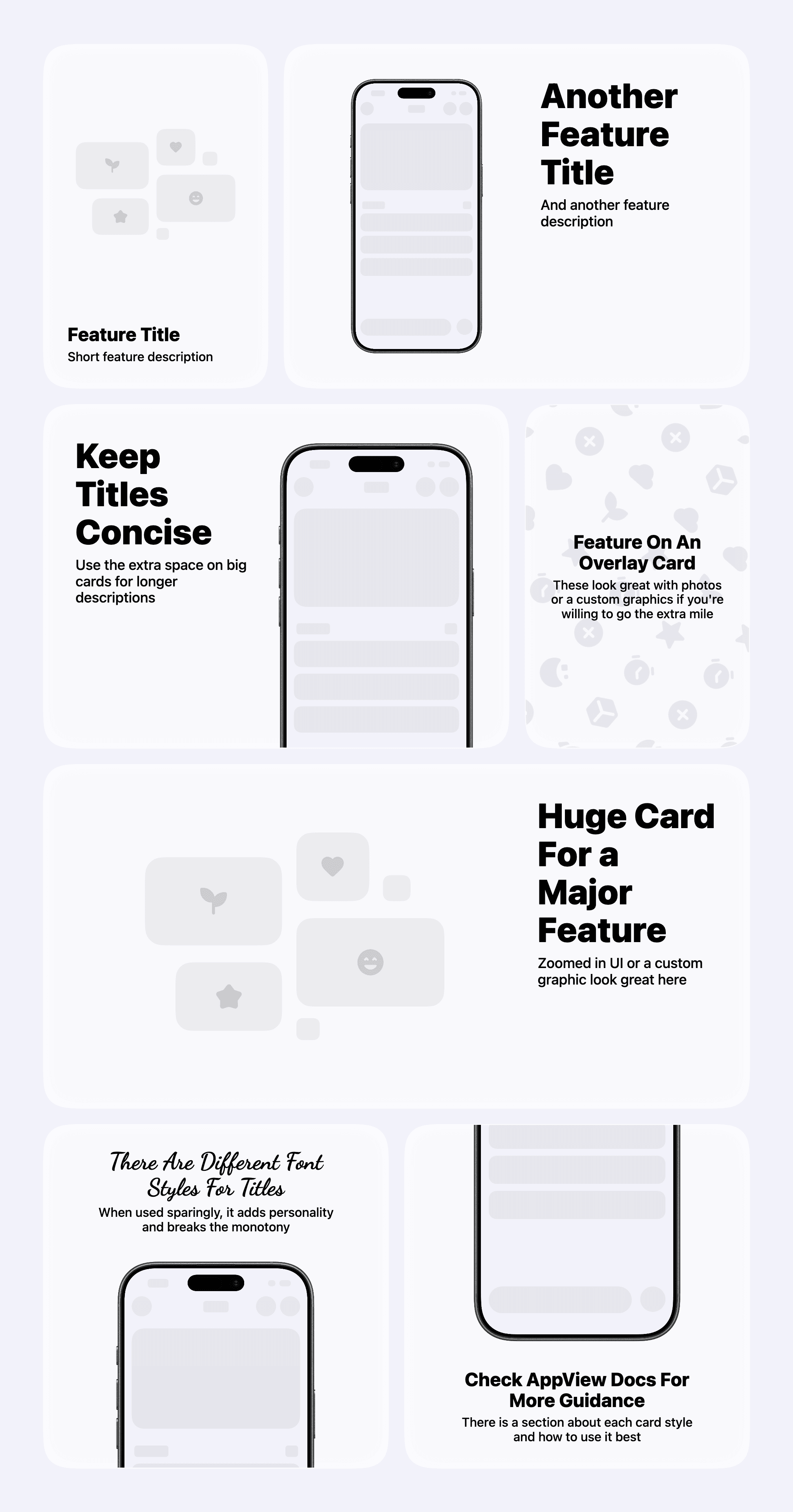
<CardGrid rowHeight={438}>
  <CardGrid.StackedCard
    maxWidth="third"
    title="Feature Title"
    description="Short feature description"
    media={
      <CardGrid.StackedCard.Image
        src="/app_view/stacked_card_image_placeholder_light.png"
        srcset={[
          {
            src: "/app_view/stacked_card_image_placeholder_dark.png",
            theme: "dark",
          },
        ]}
        alt="Grid"
        bezelCrop={{ edge: "bottom", croppedRatio: 0.1 }}
      />
    }
    textAlignment="leading"
  />

  <CardGrid.StackedCard
    maxWidth="twoThirds"
    title="Another Feature Title"
    description="And another feature description"
    media={
      <CardGrid.StackedCard.Image
        src="/app_view/screenshot_placeholder.png"
        alt="Make sure to provide an image description for accessibility purposes"
        bezel="iPhone 17 Black"
      />
    }
    textAlignment="leading"
  />

  <CardGrid.StackedCard
    maxWidth="twoThirds"
    title="Keep Titles Concise"
    description="Use the extra space on big cards for longer descriptions"
    layoutDirection="reverse"
    media={
      <CardGrid.StackedCard.Image
        src="/app_view/screenshot_placeholder.png"
        alt="Make sure to provide an image description for accessibility purposes"
        bezel="iPhone 17 Black"
        bezelCrop={{ edge: "bottom", croppedRatio: 0.25 }}
      />
    }
    textAlignment="leading"
  />

  <CardGrid.OverlaidCard
    maxWidth="third"
    imageSrc="/app_view/overlay_image_placeholder_light.png"
    imageSrcset={[
      {
        src: "/app_view/overlay_image_placeholder_dark.png",
        theme: "dark",
      },
    ]}
    title="Feature On An Overlay Card"
    description="These look great with photos or a custom graphics if you're willing to go the extra mile"
    textAlignment="center"
  />

  <CardGrid.StackedCard
    maxWidth="full"
    title="Huge Card For a Major Feature"
    description="Zoomed in UI or a custom graphic look great here"
    media={
      <CardGrid.StackedCard.Image
        src="/app_view/stacked_card_image_placeholder_light.png"
        srcset={[
          {
            src: "/app_view/stacked_card_image_placeholder_dark.png",
            theme: "dark",
          },
        ]}
        alt="Grid"
        bezelCrop={{ edge: "bottom", croppedRatio: 0.1 }}
      />
    }
  />

  <CardGrid.StackedCard
    maxWidth="half"
    title="There Are Different Font Styles For Titles"
    titleFontStyle="cursive"
    description="When used sparingly, it adds personality and breaks the monotony"
    media={
      <CardGrid.StackedCard.Image
        src="/app_view/screenshot_placeholder.png"
        bezel="iPhone 17 Black"
        bezelCrop={{ edge: "bottom", croppedRatio: 0.5 }}
        alt=""
      />
    }
    layoutDirection="reverse"
    textAlignment="center"
  />

  <CardGrid.StackedCard
    maxWidth="half"
    title="Check AppView Docs For More Guidance"
    description="There is a section about each card style and how to use it best"
    media={
      <CardGrid.StackedCard.Image
        src="/app_view/screenshot_placeholder.png"
        bezel="iPhone 17 Black"
        bezelCrop={{ edge: "top", croppedRatio: 0.5 }}
        alt=""
      />
    }
    layoutDirection="forward"
    textAlignment="center"
  />
</CardGrid>
Template 6
Preview
Code
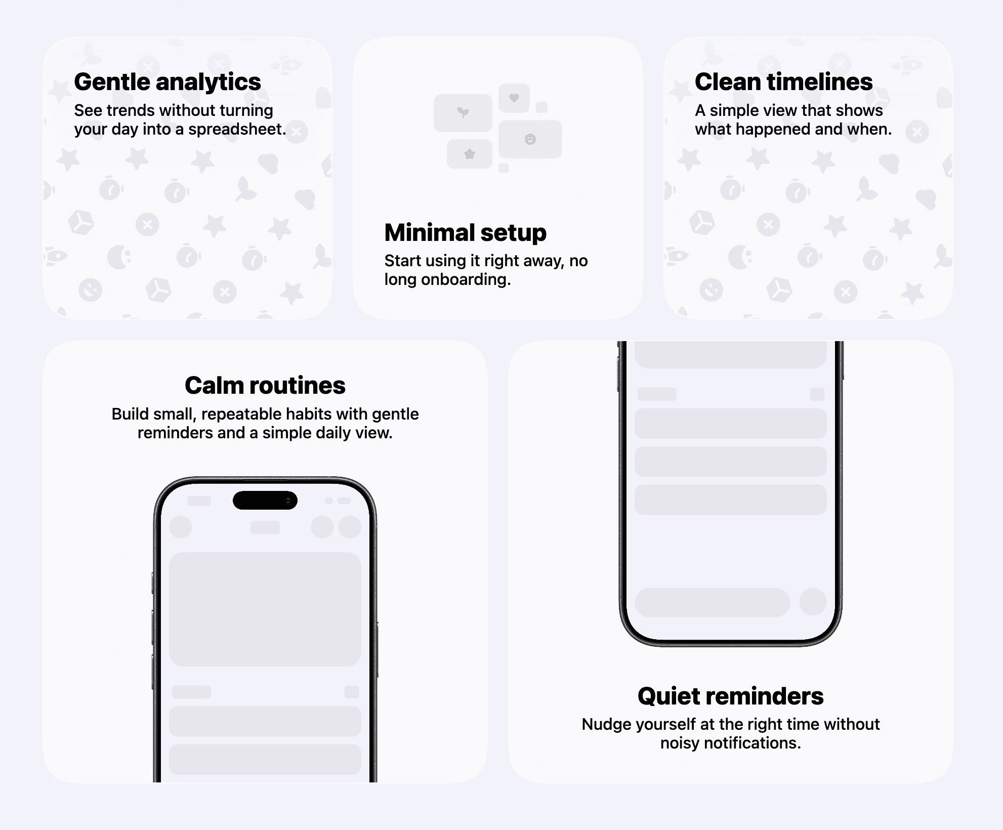
  <CardGrid rowHeight={280}>
    <CardGrid.OverlaidCard
      maxWidth="third"
      title="Gentle analytics"
      description="See trends without turning your day into a spreadsheet."
      imageSrc="/app_view/overlay_image_placeholder_light.png"
      textAlignment="topLeading"
    />

    <CardGrid.StackedCard
      maxWidth="third"
      title="Minimal setup"
      description="Start using it right away, no long onboarding."
      media={
        <CardGrid.StackedCard.Image
          src="/app_view/stacked_card_image_placeholder_light.png"
          alt=""
        />
      }
      layoutDirection="forward"
      textAlignment="leading"
    />

    <CardGrid.OverlaidCard
      maxWidth="third"
      title="Clean timelines"
      description="A simple view that shows what happened and when."
      imageSrc="/app_view/overlay_image_placeholder_light.png"
      textAlignment="topLeading"
    />
  </CardGrid>

  <CardGrid rowHeight={438}>
    <CardGrid.StackedCard
      maxWidth="half"
      title="Calm routines"
      description="Build small, repeatable habits with gentle reminders and a simple daily view."
      media={
        <CardGrid.StackedCard.Image
          src="/app_view/screenshot_placeholder.png"
          bezel="iPhone 17 Black"
          bezelCrop={{ edge: "bottom", croppedRatio: 0.35 }}
          alt=""
        />
      }
      layoutDirection="reverse"
      textAlignment="center"
    />

    <CardGrid.StackedCard
      maxWidth="half"
      title="Quiet reminders"
      description="Nudge yourself at the right time without noisy notifications."
      media={
        <CardGrid.StackedCard.Image
          src="/app_view/screenshot_placeholder.png"
          bezel="iPhone 17 Black"
          bezelCrop={{ edge: "top", croppedRatio: 0.35 }}
          alt=""
        />
      }
      layoutDirection="forward"
      textAlignment="center"
    />
  </CardGrid>
Template 7
Preview
Code
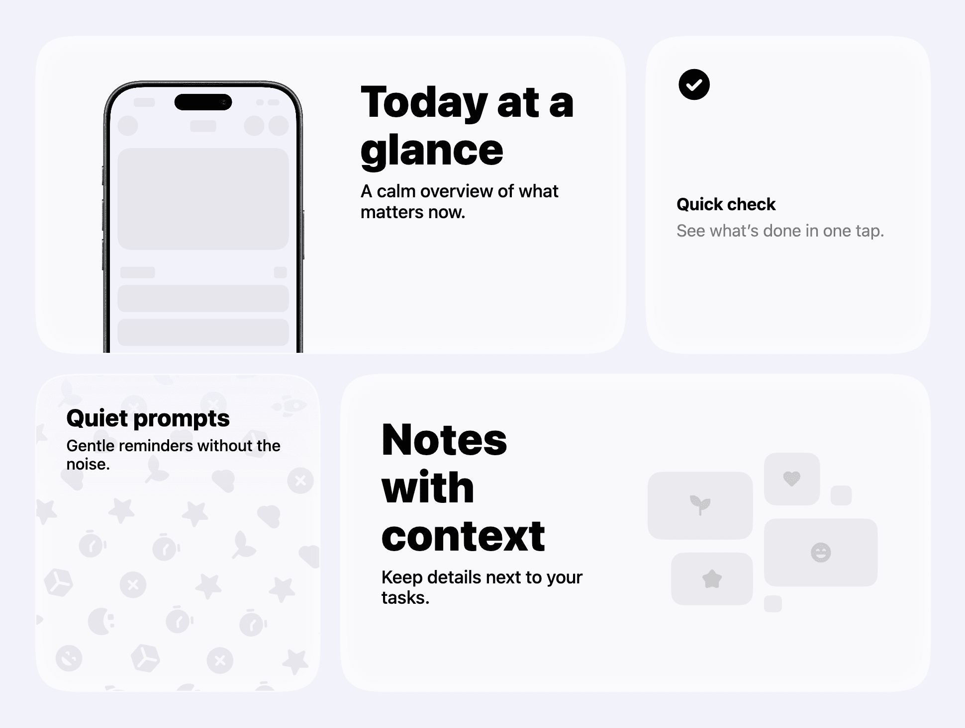
  <CardGrid rowHeight={320}>
    <CardGrid.StackedCard
      maxWidth="twoThirds"
      title="Today at a glance"
      description="A calm overview of what matters now."
      media={
        <CardGrid.StackedCard.Image
          src="/app_view/screenshot_placeholder.png"
          bezel="iPhone 17 Black"
          bezelCrop={{ edge: "bottom", croppedRatio: 0.35 }}
          alt=""
        />
      }
      layoutDirection="forward"
      textAlignment="leading"
    />

    <CardGrid.IconCard
      maxWidth="third"
      iconName="check_circle"
      title="Quick check"
      description="See what’s done in one tap."
    />

    <CardGrid.OverlaidCard
      maxWidth="third"
      imageSrc="/app_view/overlay_image_placeholder_light.png"
      title="Quiet prompts"
      description="Gentle reminders without the noise."
      textAlignment="topLeading"
    />

    <CardGrid.StackedCard
      maxWidth="twoThirds"
      title="Notes with context"
      description="Keep details next to your tasks."
      media={
        <CardGrid.StackedCard.Image
          src="/app_view/stacked_card_image_placeholder_light.png"
          alt=""
        />
      }
      layoutDirection="reverse"
      textAlignment="leading"
    />
  </CardGrid>